All the latest.
Form design for humans
19 Apr 2021A good form is like a good recipe. Too little information, and the results are going to be half baked. Too much, and the cook’s going to be overwhelmed with all the steps, get frustrated, and put the turkey in the toaster. The trick is asking for just the right amount of information while presenting it as simply as possible.
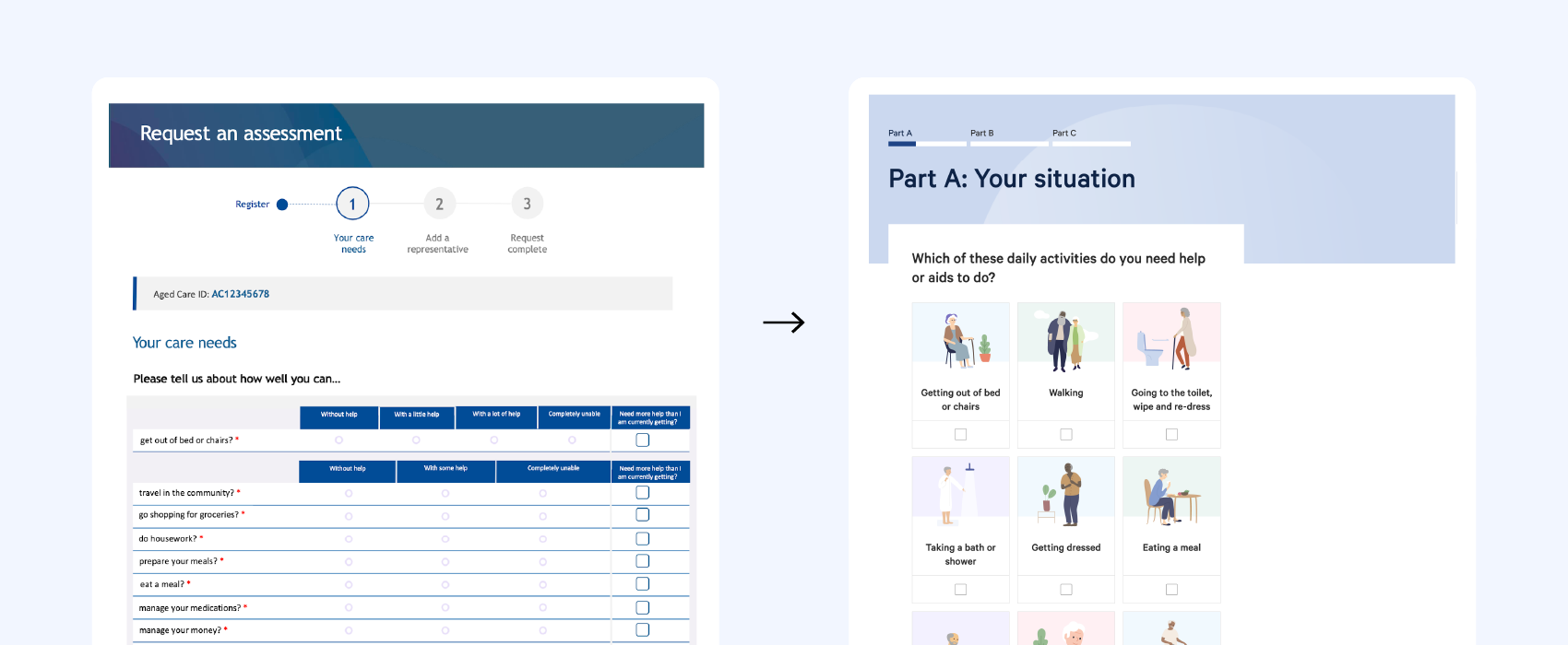
In our recent work on the Australian Government’s My Aged Care website, a lot of thought went into how we could find this balance with the Apply online feature. Fourteen weeks, 12 prototypes, multiple hospital and call centre visits, and countless user testing sessions later, we found the winning recipe.

Hamish Topen
Senior Product Designer
Featured Posts
- It's time to bring implementation into policy design
- The power of collaboration: Navigating emerging technology for smarter service delivery
- Future Led: Building a community committed to making a difference
- New Dementia Australia website "beautifully considered and empowering"
- InsideU recognised for excellence in design at the Good Design Awards
