A good form is like a good recipe. Too little information, and the results are going to be half baked. Too much, and the cook’s going to be overwhelmed with all the steps, get frustrated, and put the turkey in the toaster. The trick is asking for just the right amount of information while presenting it as simply as possible.
In our recent work on the Australian Government’s My Aged Care website, a lot of thought went into how we could find this balance with the Apply online feature. Fourteen weeks, 12 prototypes, multiple hospital and call centre visits, and countless user testing sessions later, we found the winning recipe.
![Asset_1[1]](https://blog.liquidinteractive.com.au/hs-fs/hubfs/Asset_1%5B1%5D.png?width=1700&name=Asset_1%5B1%5D.png)
What problem were we trying to solve?
With over four million Australians now over 65 and expected to live into their 80s, there are more people needing aged care than ever before. For an older person to be able to access aged care services, however, they first need an assessment to determine their eligibility and level of need.
Previously, the only way to receive an assessment would be through a GP or to call My Aged Care. On the call, the operator would ask a list of questions, which people sometimes needed help answering. Because of the amount of information required—over 200 pieces of data are collected from each user to determine eligibility for an assessment—these calls could take between 15-45 minutes, sometimes longer. It was especially challenging for people with hearing and speech impairments, and those who had complex needs. The goal of this project was to provide an easy and equitable option for people to complete this process online.
Making something that looks simple and is easy to use is hard work. Fortunately, at Liquid, that's something we specialise in.
In the early stages of the design process, it’s always helpful to look for precedents from other trusted, credible sources to help validate your ideas or reinforce your decisions. We found a handy article called “Structuring Forms” on gov.uk, which had a lot of parallels with the work we were doing. For the purpose of this blog, we’ve framed the work we did on Apply online around the five key ideas it presents.
1. Design your forms for the format they’ll appear in
Your grandma’s cookbook from 50 years ago will always have a place on the shelf, but digital recipes now come with videos! And checklists! And shopping links! Redesigning for a user-driven, digital experience gives you the chance to rethink the whole process and get the most out of the medium.
A lot of detail can be packed into the form when the process is guided by a trained operator. Without that guidance, it can be overwhelming. So, for Apply online, we weren’t just going to ask users to complete a digital replica of the data entry forms used by the call centre and clinicians. We had to design a form that a user would be able to fill out on their own, with no help, yet still capture the 200 discrete pieces of data that were needed to complete a successful application.
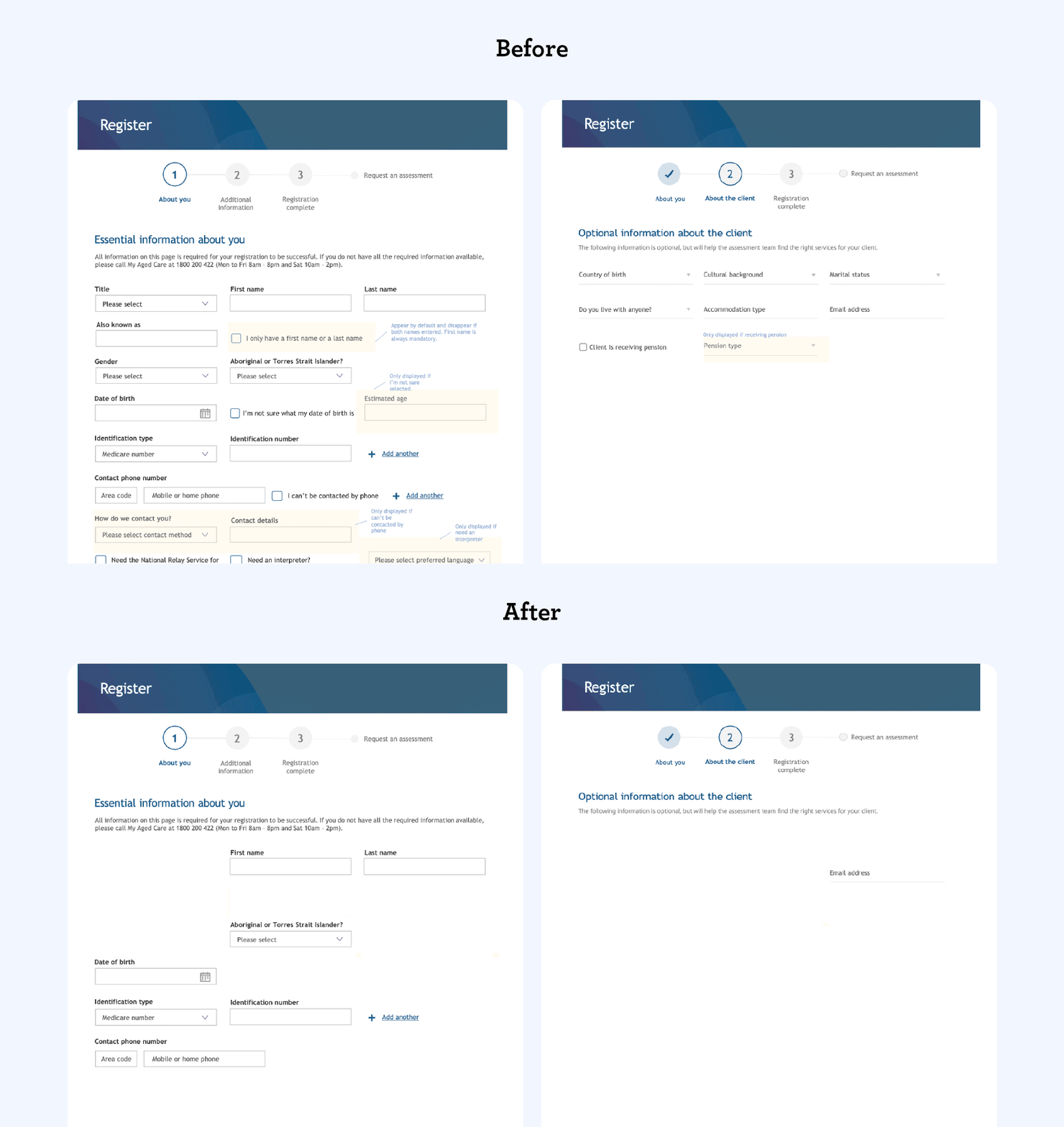
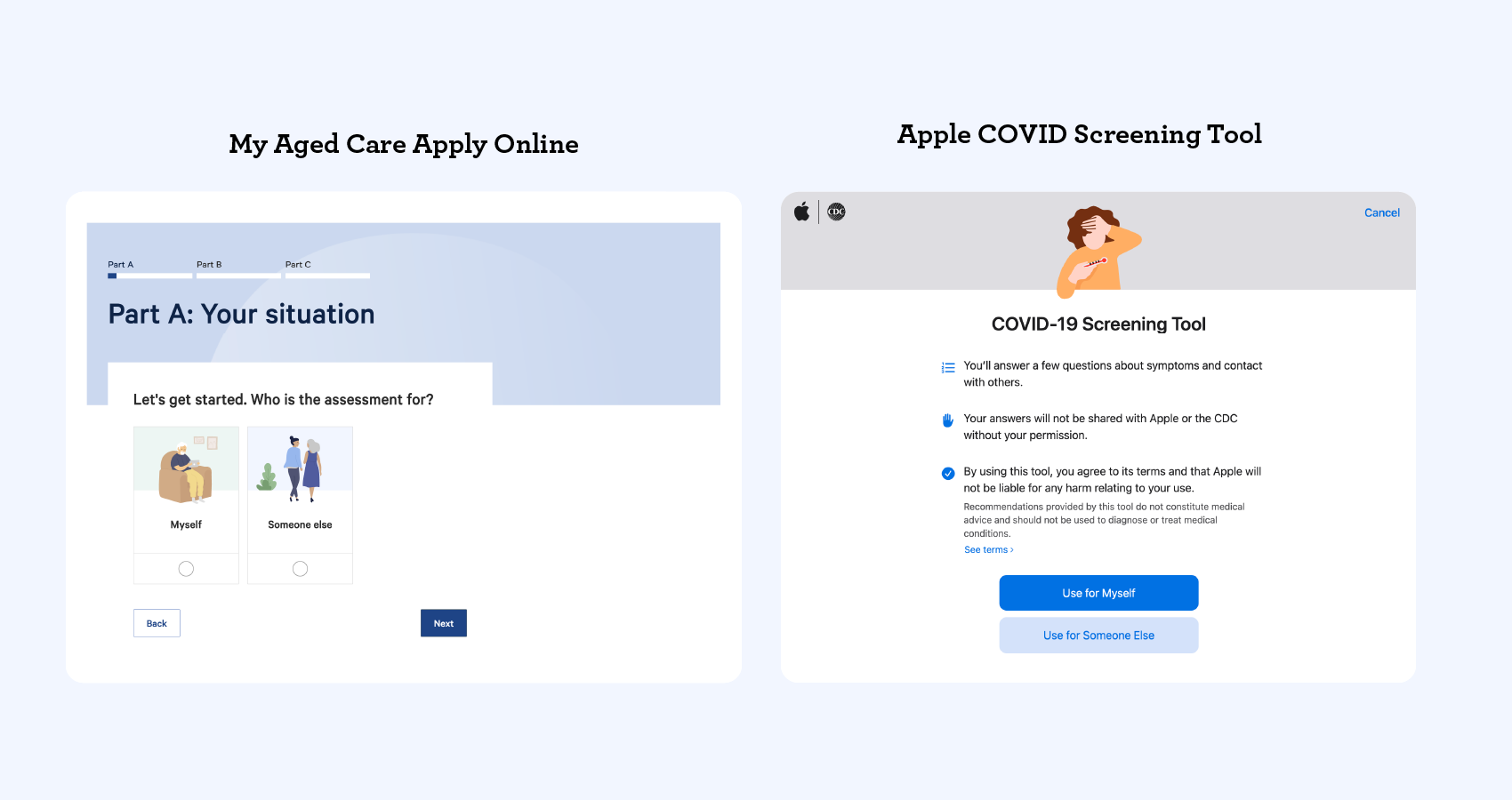
One of the biggest advantages of a digital form is the ability to customise the questions. By introducing branching questions, we were able to filter out entire streams of information that weren’t relevant to the user. We also used this to customise the language throughout the entire form. For example, right at the start, we ask if the user is filling out the form for themselves or for someone else. The questions that follow are customised according to their selection. Small personalisations like these improve the signal-to-noise ratio of the whole experience for the user.
![Asset_2[1]](https://blog.liquidinteractive.com.au/hs-fs/hubfs/Asset_2%5B1%5D.png?width=1700&name=Asset_2%5B1%5D.png)
Ease and visibility of navigation is another advantage of a digital form. Completing a form over the phone can seem endless, with no real way to tell what point you’re at in the process. With Apply online, we offer the user the ability to go back, edit details, and get validation, all while seeing how far they’ve progressed with a dynamic progress bar.
If you know the strengths and opportunities of the format you’re working with, you can design around them for a better experience.
2. Know why you’re asking every question
Nobody likes a long form.
This may seem like a simple one, but “data creep” is a very real threat to good user experiences. What starts out as a straightforward form can very quickly become death by a thousand questions.
The reality is, every question comes at a cost. Each one you ask becomes one more barrier for the user—one more chance for them to drop out. Every additional question also adds extra time behind the scenes to process the data. In short, it diminishes the user experience and increases everyone’s workload.
An easy way to avoid this is to implement a “question protocol”. Simply put, a question protocol is an easy, objective way to decide which questions are important and which ones aren’t.
For us, this meant boiling down the form to only questions that would directly provide aid to the user. Some of the original questions, particularly optional ones, were understandably useful for data collection objectives. However, they did not enhance the service the user would be receiving, so we eliminated them.
The gov.uk article gives a great example of a question protocol:
Only add a question if you know:
- that you need the information to deliver the service
- why you need the information
- what you’ll do with it
- which users need to give you the information
- how you’ll check the information is accurate
- how to keep the information up to date and secure
3. Design for the most common scenarios first
The basic idea here is: don’t waste people’s time.
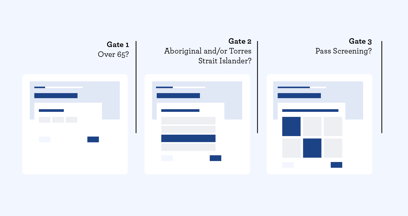
To be eligible to even apply for an aged care assessment, you have to meet some basic criteria. So, it would make sense to ask the eligibility questions up front, right? However, when the call centre form was first converted to a digital format, the early prototypes didn’t quite hit the mark.
It became clear very quickly that the questions were in the wrong order. A user could make it the entire way through the first section only to find out that they were not eligible to apply because they didn’t meet the age or needs criteria. That was not a good user experience.
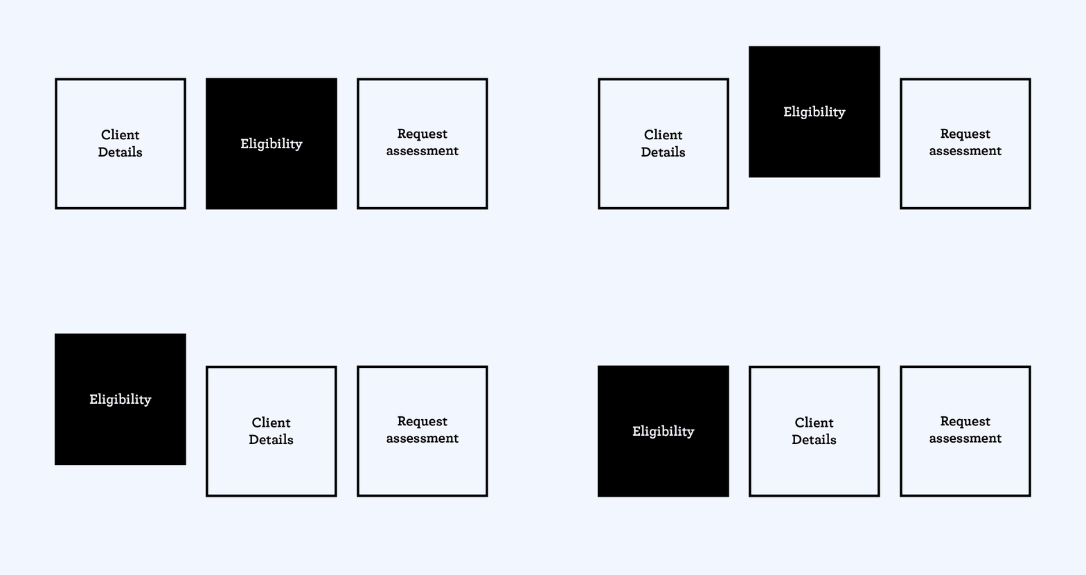
So, we decided to move the three “gates”, where users might be disqualified from the process, to the beginning of the form. Doing this ensured that only eligible users would progress to the next stage. This simple decision ended up being one of the biggest contributors to the overall success of the tool.
4. Start with one thing per page
Another key advantage of a digital form is the opportunity to control the pace at which you present information. The Apply online form collects a lot of information from a user, but it doesn’t feel overwhelming or daunting because of the way the questions are presented; we stick to one question, or topic, per page.
Asking questions this way helps to improve comprehension, retention, and navigation. You also get more granular analytic data about how easily users move through each step. From there, you can work out where you may need to add more “steps” to a question. In the Apply online form, where we have extension questions, we’ve made them progressively reveal in line. This maintains a singular focus when you have multiple threads to follow.
Getting this clarity and pacing right was especially vital for making sure that Apply online would be accessible for everyone who needed it.
5. Structure your form to help users
Just because a form field has a particular label or appearance in the backend doesn’t mean that’s what the user has to see.
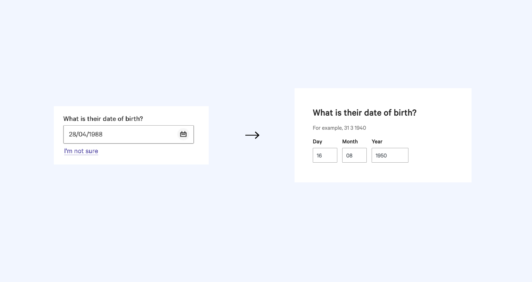
In the database we were using, “Date of birth” appeared as a single field. In early prototypes, this was replicated in the form of a date picker. We soon found that this method was particularly challenging for older users; having to scroll through 60+ years in a dropdown was not efficient or user-friendly! So we switched to three individual free text fields instead, requiring much less effort from the user and leaving less room for error.
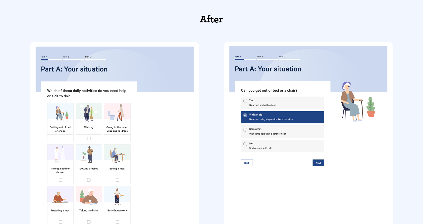
We also took this approach to improve how a user indicates the level of help they require in different aspects of their home life. Initially we had a matrix that allowed them to select a level for each line item individually, which was an efficient way to collect the data. However, without the support of the call centre operator, it really didn’t provide enough help for them to make informed decisions. It just wasn’t cutting it from a UX perspective.
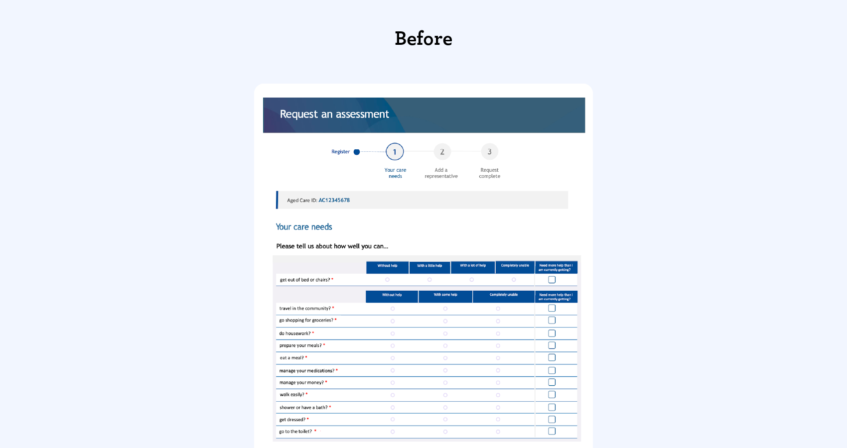
So, we added clear visuals to the items and changed the initial response to a Yes/No selection for each. From there, we could ask follow up questions, one at a time, to get the right level of information. We could still fill out the database matrix one-for-one, but make it much more digestible for the user.
Thoughtful changes for big results
From the time Apply online was launched in January 2020 to the time of writing (April 2021), more than 43,000 successful Apply online applications have been completed.
That’s 43,000 applications that would have otherwise been lengthy phone calls with an operator, each piling up operational costs. Now those operators can spend more time on the more complex cases that really need extra assistance.
Since going through this process for Apply online, we’ve started to see these standards quickly emerging as best practice elsewhere—even Apple’s COVID-screening form uses similar questions and input styles!
So, what did we take away from this experience?
It’s clear that the best way to level up your form design is to shift from thinking about what questions you’ll be asking, to how you’ll be asking them and why. And it takes work to get it right! Our success with Apply online took a lot of research, user testing, and a bit of trial and error, but the end result is worth it.
Our understanding of what makes a good user experience is constantly evolving. It’s always a good idea to critically examine each step of the experience, even with something as seemingly simple as a form, and ask: “How can we make this better?”
